This two-bedroom condo with a den at The Coloradan, just steps from Denver’s Union Station, was redesigned to reflect a sleek, masculine style with black, white, and gray tones and bold blue accents. Unique wallpapers, a new kitchen island, luxury vinyl plank flooring, and tailored closet systems add both function and style. Layered textures and carefully selected furnishings make this high-rise home feel comfortable and inviting for a family of four.

When I decided to remodel my condo on the 22nd floor of a sleek, downtown Denver high-rise, I knew exactly where to begin—my decades-long collection of inspiration. As a longtime subscriber to interior design magazines, I’d spent years tearing out pages, filing ideas, and curating a personal library of features that spoke to me. Those saved images became the foundation for the space I dreamed of creating: elegant, personalized, and uniquely mine.
This is a special project for me because…well…it’s my own condo! I created the space to be a showcase of my work and a mini-showroom of the manufacturers I use on many of my projects. Now you know that if I recommend a product, it’s likely because I’ve had personal experience with similar items from the same manufacturer.
When I began, I started with the living room wallpaper and built the design for the rest of the condo from the colors in that wallcovering. From there I was able to coordinate all the details that make the space functional and luxurious at the same time. Our home allows us to entertain while still providing a cozy space when it’s just my husband and myself.
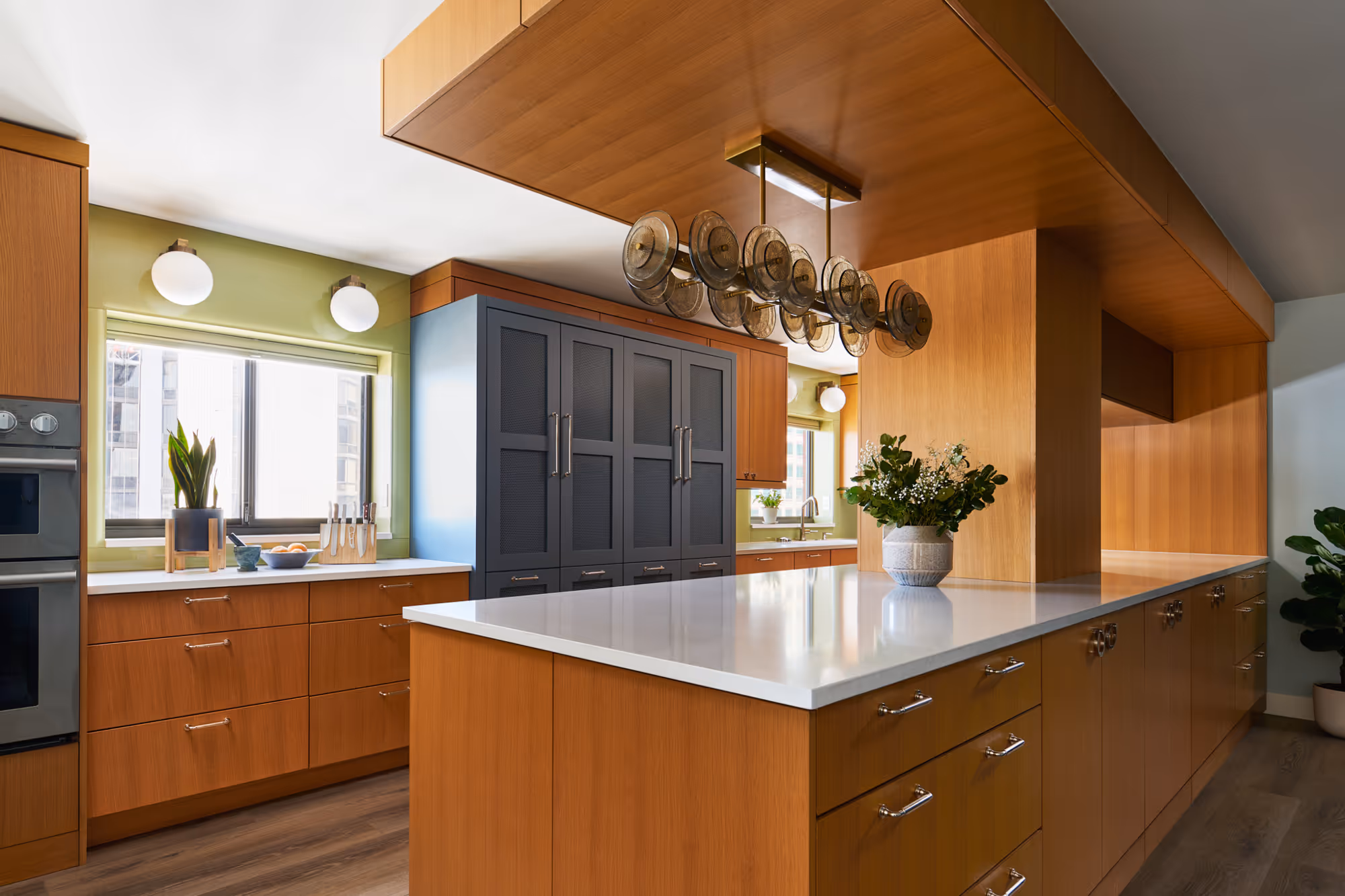
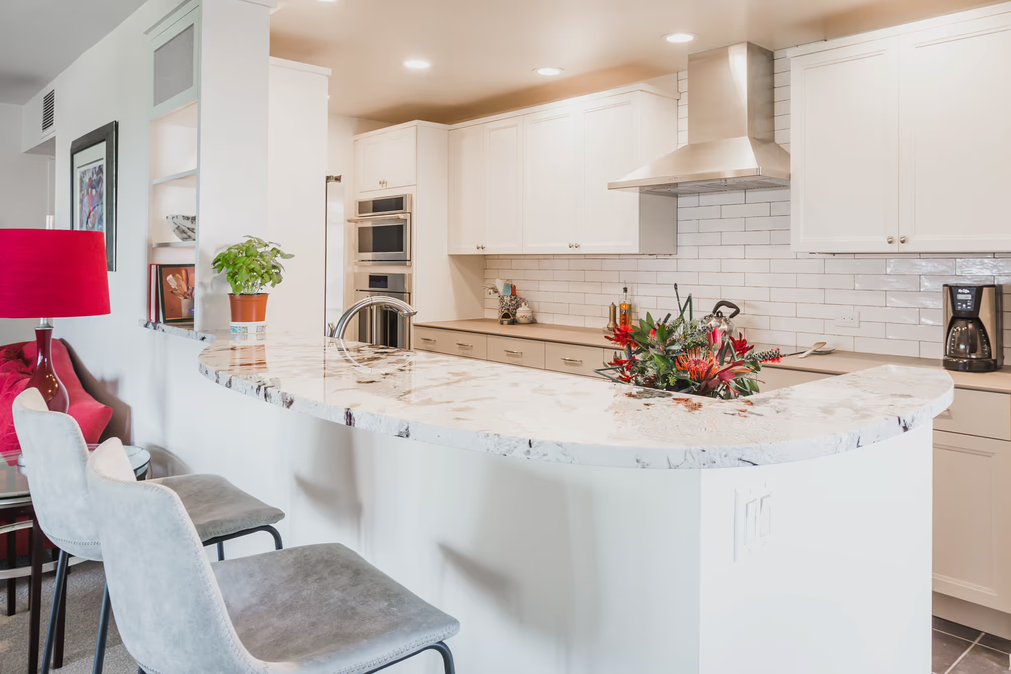
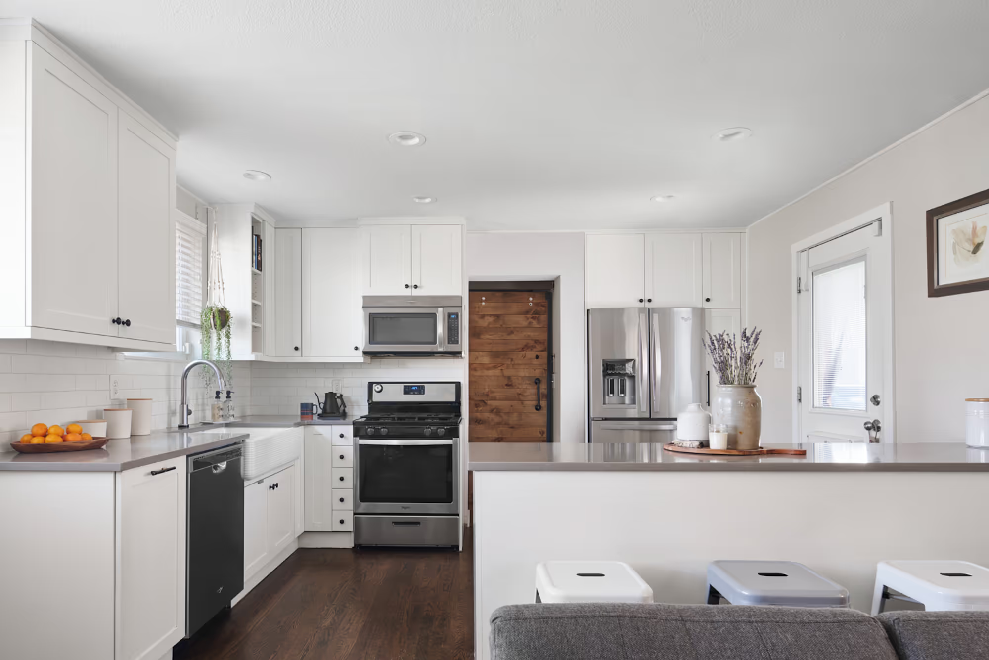
This home offers a great surprise for guests: a beautiful lake view outside expansive rear windows. The old, enclosed kitchen in the middle of the house was outdated, obscured the views, and impeded large gatherings. This couple hosts large family get-togethers several times a year and wanted a better space to entertain with additional seating, increased storage, and expansive counter space for buffet dining.
For this renovation, on the west wall, I shifted the entrance to the adjoining laundry room north. That allowed me to extend the south wall’s cabinet run all the way to the corner, eliminating a useless space. By relocating the wall ovens to the south wall, I was able to create a symmetrical feature wall, framing the cooktop with tall appliances and adding a quartz countertop and backsplash.
For increased storage and to supply the requested counter space for buffet-style entertaining, the small desk on the west wall was replaced with a tall pantry cabinet and a long floating shelf was added below wall cabinets. This allowed the clients to relocate their canisters and other items that formerly lived on the countertops to the shelf for easy access and opened the counter space for buffets as requested.
Another way storage was maximized was by replacing under-counter cabinets with deep drawers throughout the kitchen. To use every inch of space, a cabinet and drawer bank, accessible from outside the kitchen, were designed for the corners of the U-shaped cabinets.
The objective of expanding the kitchen for entertaining was accomplished by removing the north wall (between the kitchen and living room) and replacing it with counter seating. With this new layout, everyone can see the amazing lake views when entering the house and when entertaining, guests can be part of the action while remaining outside the main workspace.
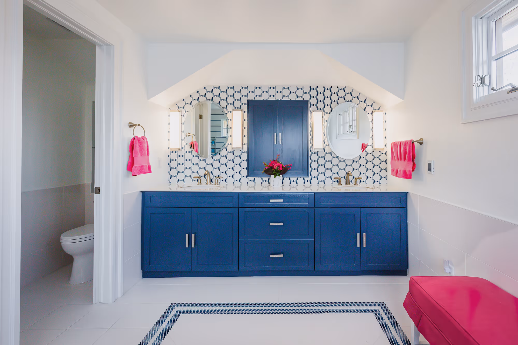
Living with dull, muted yellow marble surfaces in their bathroom for over a decade, these clients were desperate for a bathroom makeover. Their giant tub deck needed to go but, the rest of the bathroom layout still worked for the couple. Our major challenge was helping this couple merge their tastes into something that fit them both. The husband is all about bold color and major statements while the wife prefers a softer, more muted décor.
After finding the perfect micro-hex mosaic tile in a pattern and color scheme that appealed to both husband and wife. We were able to create a space they both can love. Now they wake up to a bright, happy bathroom. The perfect way to start your day.
Living in a home for a while before diving into a remodel project is the perfect way to figure out what does and doesn’t work in your new condo. That is exactly what this couple did before reaching out to me to remodel their kitchen and bathrooms. Even with the constraints of condo living, having that information allowed me to vastly improve their everyday life.
The kitchen was previously remodeled with high-end appliances and European cabinets, but it just didn’t work for my clients. Lack of counter and cooking space were major issues for the new residents. It was time to revamp of the kitchen layout and change color schemes in the kitchen and bathrooms.
Now they have ample counter space to prep meals and can fit more than one pan on the cooktop at a time, making everyday chores so much easier. Adding a second sink in the bathroom means the husband is no longer relegated to the guest bath and they can start their day together.
Making everyday life more livable is what good design is all about.
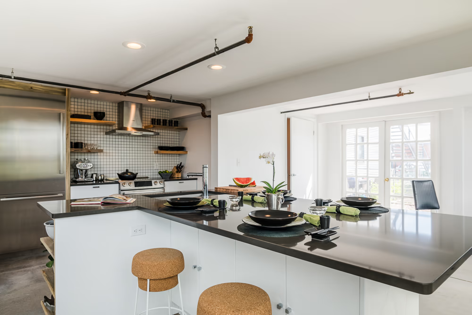
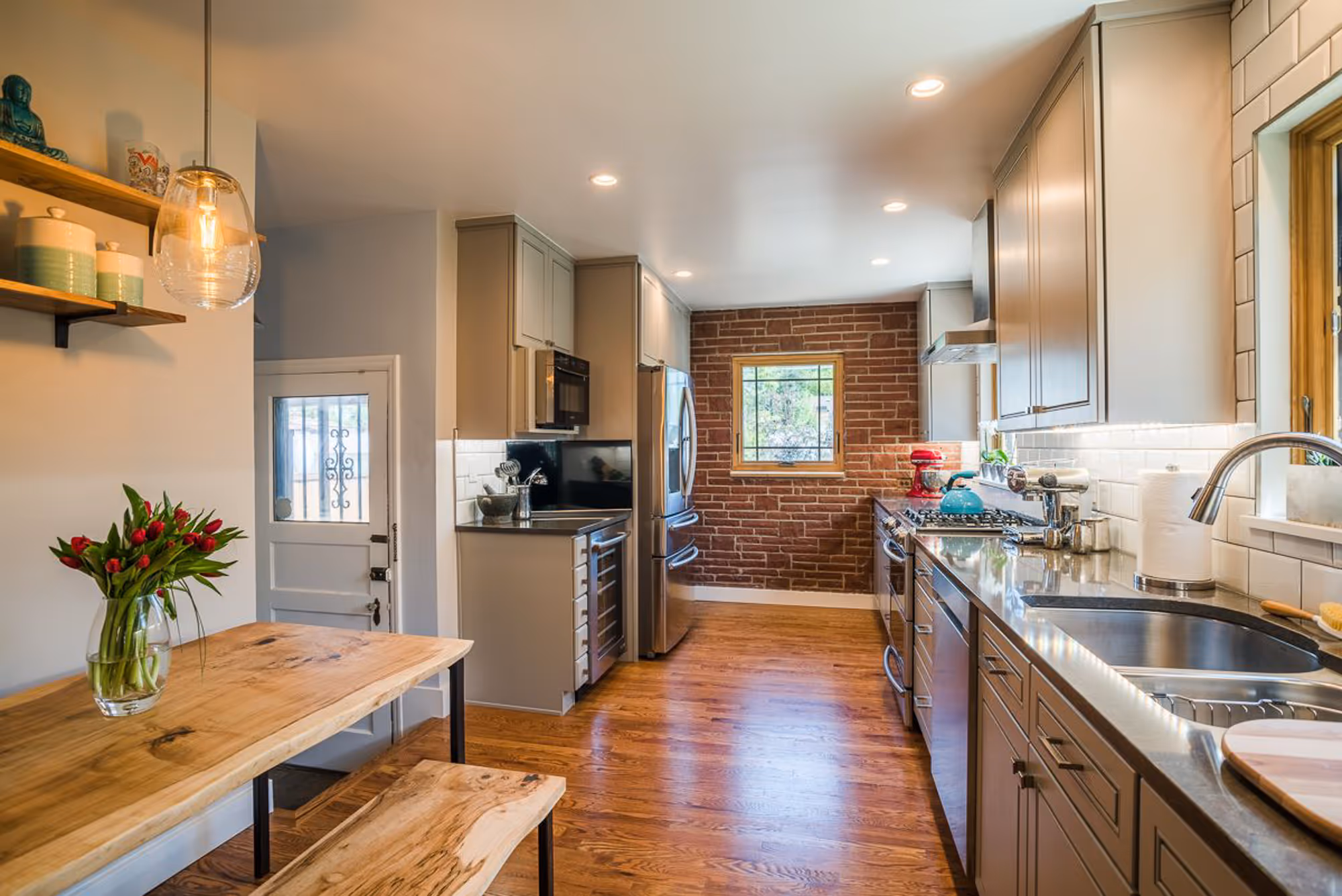
After living in this industrial space for five years, the homeowner decided she could no longer live with the shortcomings – a kitchen consisting of only a sink, refrigerator, & hotplate and a single bathroom on the lower level.
On the main floor, several walls were removed and/or opened up to make space for a full kitchen. In the sleeping loft, space was carved out for a 3/4 bath and stackable washer/dryer while still allowing as much space as possible for clothes storage. All new finishes in the main bathroom rounded out the remodel.
In keeping with the industrial feel, floor tile was removed to expose concrete flooring and a thread of Beetle-Kill Pine was used as an accent in the new bathroom, kitchen, and main floor guest bath.
Designed by Michelle Ku for Three Week Kitchens.
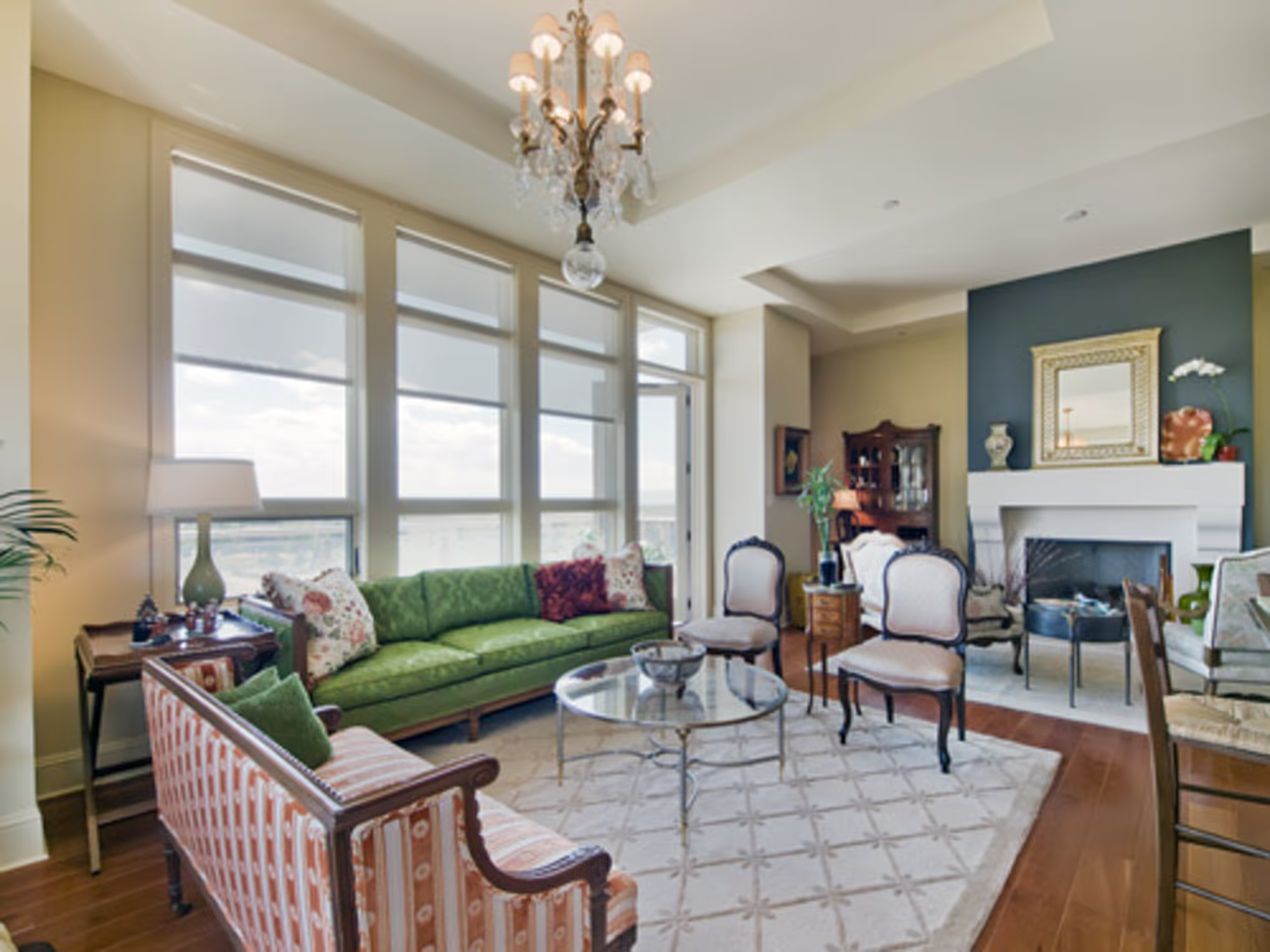
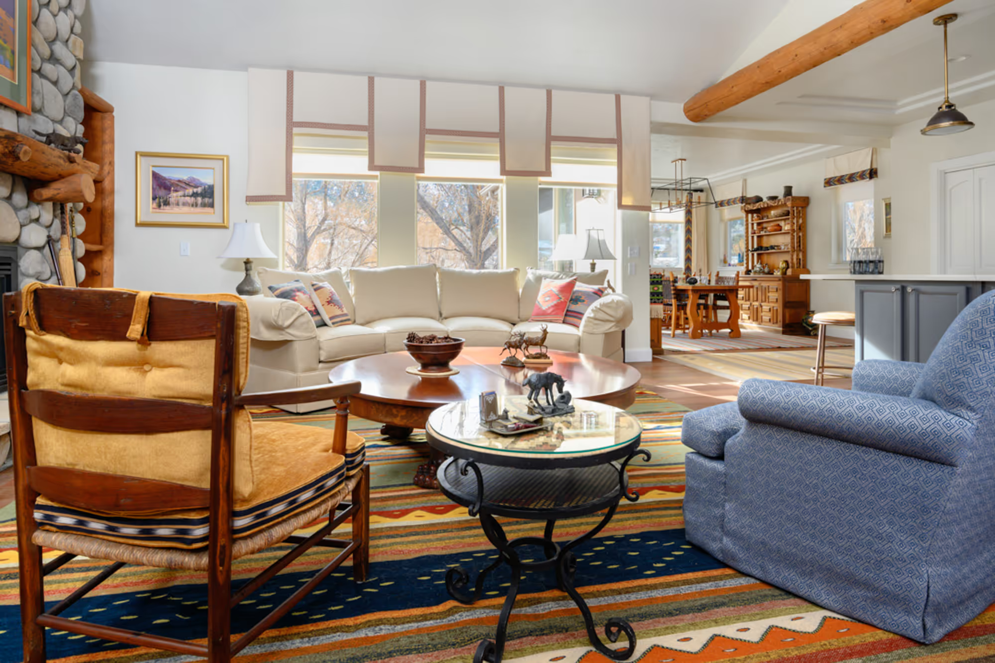
The owner of this condo inherited furnishings from their mother’s estate and everything was moved in without any thought to functionality. I rearranged the existing furniture, removed a few pieces, and brought in a couple more from another residence. At that point, all we needed to do was purchase area rugs, bar stools for the island, and pillows for the loveseat and sofa. To wrap it up, I added the dark grey accent walls on the fireplace and hallway, hung the homeowner’s art, and placed her accessories.
This empty-nest couple in Poncha Springs (outside Salida) had recently completed a major addition and remodel of their modest spec home, but there was still work to be done. After completing the remodel, I helped them design the main living spaces and bedrooms where we added area rugs, custom window treatments, and decorative light fixtures.
But, the most rewarding part of the project was helping them reuse inherited family furnishings. We reupholstered chairs and a chaise lounge that we featured in the bedroom and living room. The standouts are two chairs in the bedroom that we reupholstered with old Native American rugs inherited from a favorite relative. One rug was used for the chair backs, another for the seats, and a new fabric was used everywhere else the rugs were not large enough to cover.

This empty-nest couple had been living in their new home for several years when they reached out to me for new furnishings. The wife had recently purchased a piece of art for her breakfast nook and wanted to use the colors for her new scheme. While I was there, I saw a great opportunity to vastly improve the room by updating the fireplace wall.
As with most builder spec homes, the fireplace was very bland with 12×12 ceramic tile surrounding the firebox and a simple wood mantle. To the left of it was a two-foot deep, eight-foot high niche that spanned to the opposite wall. Adding custom built-ins in the niche and a hearth and crown molding that spanned the built-in and the fireplace made two incohesive elements into one feature that completely transformed the room while adding needed closed and open storage.
This merged family had a toddler and college-aged children and they were very much in a transitional phase: the college students were moving into their own apartments so the parents used that opportunity to donate their old furnishings to the kids, leaving them with empty rooms that needed to be furnished and decorated.
In the great room I was asked to keep the blue wall and cloud photo over the fireplace and the adjacent open kitchen had red dining chairs with a bohemian feel. I used both of these elements as my jumping off point for a blue and red color scheme. In the basement, wide open spaces and a request from the homeowners were the impetus for the colossal custom built-in. There were some existing furnishings with a green and orange stripe that were to remain, so I found the fun bird print with coordinating colors that tied everything together.
My client’s lifestyle is very different than the one people were living when this house was built. The cook(s) are no longer hidden away in the kitchen. It was time to make the kitchen feel like it was part of the rest of the main floor. Removing the narrow swinging door into the kitchen, expanding the doorway width, and adding an arch that mimicked other doorway archways melded the kitchen with the rest of the living spaces.
Having a relative in a wheelchair necessitated a full remodel of the tiny main floor bathroom. Flipping the locations of the toilet & vanity, adding an in-wall tank toilet, and replacing the bathtub with a walk-in shower totally transformed the bathroom for overnight visits while enlarging the floor space to accommodate a wheelchair.
A cluttered storage room in the basement, adjacent to the family room, became a brand new full bath. Not having to run up and down the stairs while you are watching TV, now that is a luxury not often found in older homes.
Designed by Michelle Ku for Three Week Kitchens.
.avif)
This family of five had very eclectic taste and wanted to incorporate all their existing Arts & Crafts, Asian, and Native American elements. They had very literal ideas of those styles and had already purchased reproduction furnishings. I helped them find additional furnishings and fixtures that were reminiscent of the styles they loved, yet still allowed the home to be in the “now” instead of in the past. By designing custom elements like the fireplace, cabinet doors in the dining room, and millwork to hide the arches in the entry, I was able to transform the home from a Romanesque style to one that matched their style.
Since the basement was completely closed off from the main floor, we were able to transition to a more contemporary design in their home theater/entertainment space. We removed a wall with interior windows to incorporate a room that could be used however the homeowner saw fit. Once we had a wide-open space, I created three separate areas: table tennis area, home theater, and cocktails & conversation. By covering the enclosed staircase with a custom wallcovering, I was able to transform an obstruction in the middle of the room into a focal point and set the color scheme for the rest of the space.
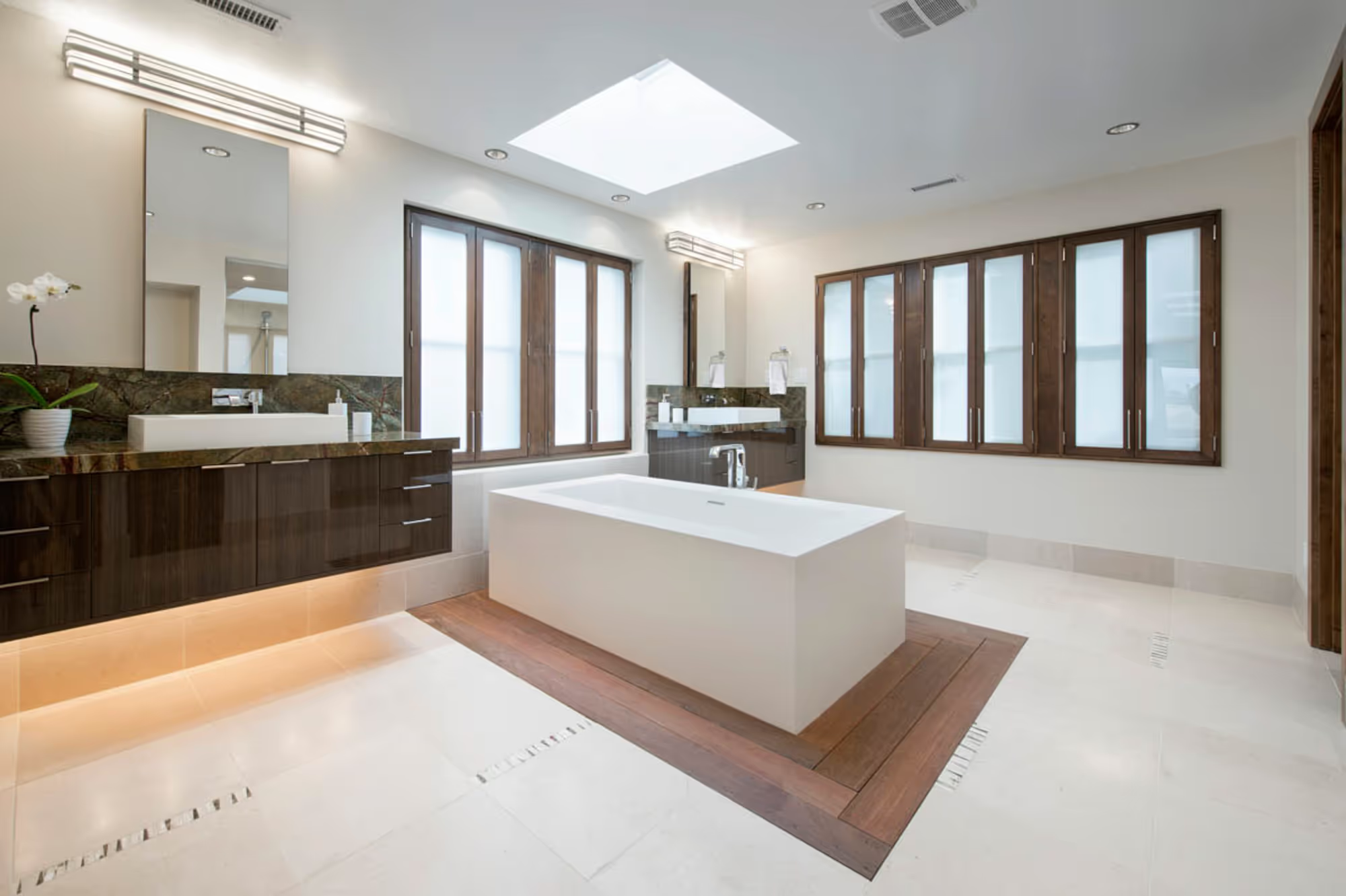
I was brought in to help Debra Toney redesign her client’s bathrooms after a catastrophic flood caused the entire home to be demoed down to the studs. The Client had been very happy with his space before the flood so there was no need to rethink how the rooms were laid out; we just needed to select all new finishes that kept the contemporary vibe and update them for a new decade.

When we started working together, my newly divorced client was in the process of divvying up the furnishings of her large Hill Top home with her soon-to-be ex in order to downsize into her new townhome. After a trip to the existing house, where I measured and photographed the furnishings, and another to her new space to measure the rooms, we were on our way to determining what she would and would not be able to use.
I created furniture plans showing her how she could reuse what she had and where she would need to fill in with new. After receiving the new furniture, I placed her art and accessories, selected new paint colors, and designed custom pillows and window treatments for the new bedroom so she could start her life anew.
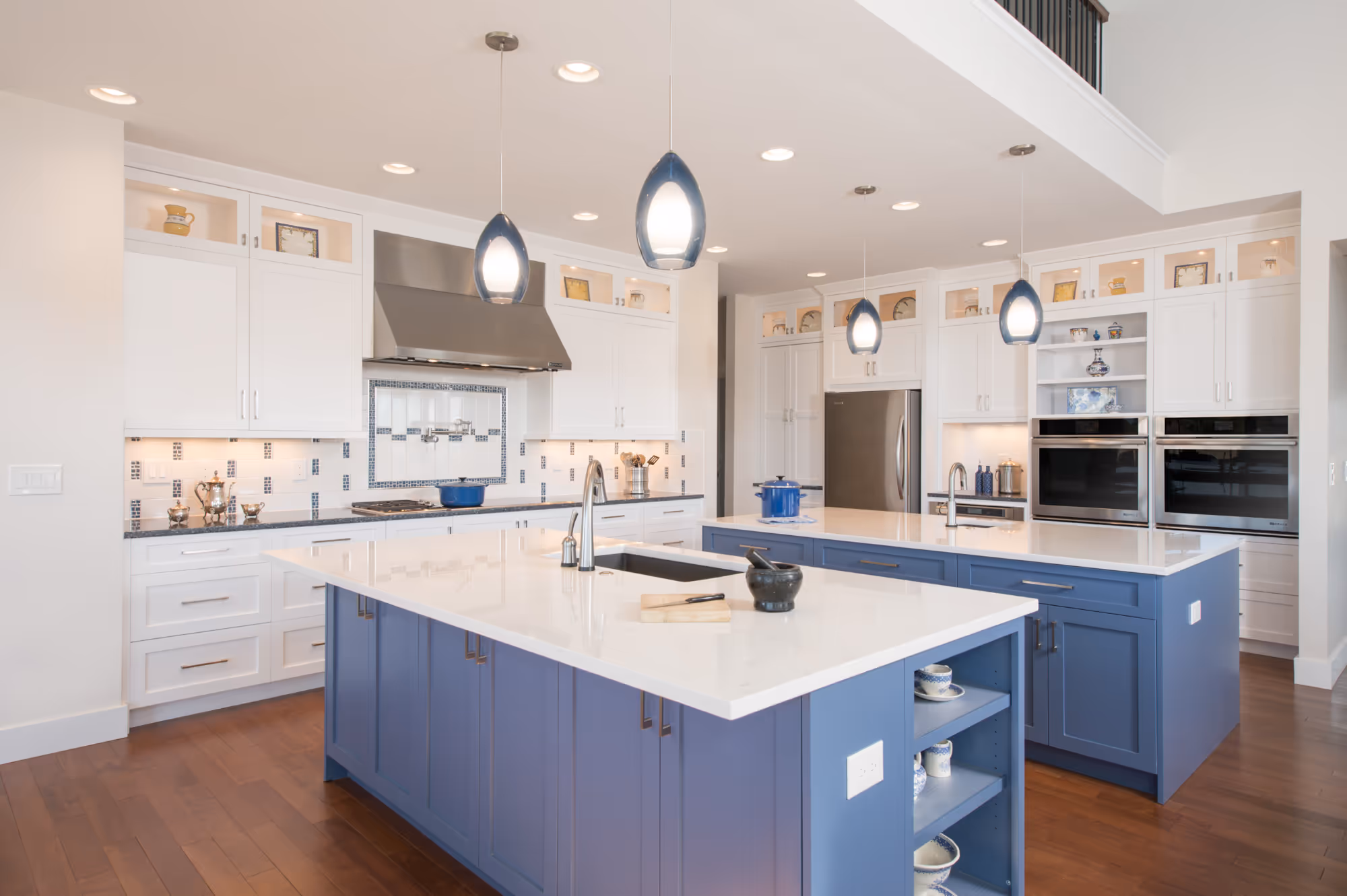
This couple was building their first permanent housing after traveling the world through the military. The wife had always dreamed of teaching cooking classes in her home and now that her husband was retired, her goal was possible.
I helped her create a new floorplan and layout with multiple work zones for various cooking/baking activities that also allowed several people to be in the kitchen without disrupting the workflow. A trip to her builder’s design showroom was used to select the final finishes for her dream kitchen.
The couple had purchased a home that had been flipped to sell. The flipper’s kitchen remodel consisted of opening (not removing) the wall between the kitchen and living room, slapping a countertop on the bar height half wall between the two rooms, and installing the bare minimum amount of cabinets (1 sink base, 1 blind corner cabinet, and 4 wall cabinets). There was only one drawer and it was not wide enough for a silverware tray. Due to lack of storage, my clients were piling cookware, canisters, and pantry supplies anywhere they could (on top of wall cabinets and countertops, in plastic rolling drawers next to the refrigerator, and in a small cabinet under the bar height counter).
In addition to improving the aesthetics, the number one goal was adding enough storage to make the very small kitchen functional. My solution was to completely remove the wall between the kitchen and living room. Removing this wall allowed me to:
Kitchen/Family Room - The client was happy with the layout in her kitchen, but not the dated look or the red Brazilian Cherry hardwood floors.
Primary bathroom – we removed the outdated drop-in tub and tub deck so that we could expand the small shower. A new free-standing tub was angled in the corner and the vanity cabinets were painted. The large wall mirror was replaced with two decorative mirrors and the overhead bath lighting was replaced with wall scones at eye level to vastly improve lighting function. New counters, sinks/faucets, and cabinet hardware completed the updated vanity. Floor to ceiling tile in the enlarged shower with a niche for toiletries and a corner shelf to rest your foot while shaving enhanced the look and function of the enlarged shower.
It was time to update this couple’s bathrooms in their historic 1910 City Park home.
Secondary hall bathroom (NKBA PEAK 2024 WINNER) – the layout, fixtures, and finishes were original to the home. A radiator under the window and a bathtub at the entry made for an uncomfortable and awkward layout. The wife longed for storage and a free-standing tub under the window that was appropriate to the era of the home. To meet her desire, every fixture in the bathroom needed to be relocated. With the new 3-drawer vanity located by the door, the tub under the window, and the toilet between them, the room now makes more sense and feels more spacious. Ceramic, mosaic floor tile consistent with the home’s era was the starting point for the new fixture and finish selections. Beautiful floral wallpaper, a decorative tile bar crowning the wall tile, and a new roman shade on the window finish out this award winning bathroom.
Primary bathroom – the existing primary bath was an addition to the home that never fit the home’s aesthetic. The shower was enclosed with floor to ceiling walls. In addition to being very dark, it made the rest of the bathroom feel extremely small. We cut one wall down and topped it with glass and added a glass “window” to the other wall that aligned with the window over the toilet to allow natural light to flow into the shower. White, laminate vanities and linen cabinets were replaced with warm wood toned, raised paneled doors that reflect the era of the home. The same floor tile as the hall bath was repeated here in a neutral, light brown and a custom decorative tile provides a decorative element in the shower. A new niche in the shower keep clutter off the shower bench and a new hand shower makes cleaning so much easier.